Comparison and Buying Guides
Transparent Keypad Design: Aesthetic Choice or Practical Signal?
Jun
Transparent keypad design is partly aesthetic, but it can also act as a practical signal. A clear body makes the device feel more like visible desk hardware than a hidden black box. For buyers comparing developer gear, that visual difference can matter, but it should not be the only reason to choose a product.
The better question is what the transparent design communicates about the device: its role on the desk, its physicality, and the way it fits into a visible AI workflow setup.
Desk aesthetic is not meaningless
Developers spend long hours at their desks. The look and feel of desk tools can affect whether a device feels inviting or annoying. A transparent keypad can pair well with modern keyboards, clear cases, RGB lighting, and compact laptop setups.
Aesthetic preference is valid, but it should follow function. If the keys are wrong, the connection is unreliable, or the device is hard to reach, the shell design will not save it.
Buy for workflow first, then enjoy the look.
Seeing electronics can increase tactility
A clear shell can make the hardware feel more tangible. You can see that it is a physical input surface, not only another software shortcut. For an AI workflow keypad, that matters because the product’s value is partly physical separation from the screen.
The visible body can reinforce the idea that microphone, approve, cancel, and return-style controls live in a specific place on the desk. That place becomes part of muscle memory.
This is subtle, but physical tools often work through subtle cues.
Trust comes from more than transparency
A transparent body does not automatically mean better build quality. Buyers should still judge key feel, connection modes, support pages, product details, and the actual workflow fit. Clear plastic can look premium or cheap depending on execution.
Trust should come from the whole purchase experience: clear product information, secure checkout, shipping details, and a contact route if something goes wrong.
The transparent design is one signal. It is not proof by itself.
Photo-friendly setups can help adoption
Some buyers care about how a device looks in a public desk photo, a workspace tour, or a product review. That is not shallow if the device is also useful. A visually distinctive keypad can make the AI workflow feel more concrete and easier to explain to others.
For teams, creators, or builders who show their desks, a clear body can be part of the product story. It says: this is the small control surface for the AI loop.
Again, the story only works if the device actually gets used.
Care notes for transparent hardware
Transparent surfaces can show dust, fingerprints, and small scratches more clearly than opaque surfaces. That does not make them bad, but buyers should know the trade-off. A clean desk and gentle handling will keep the device looking better.
Do not treat the clear body as rugged industrial equipment unless the product specifically claims that. It is desk hardware. Place it where it will not be crushed by a laptop stand, dropped from a bag, or scraped by loose metal objects.
The practical care rule is simple: if you want it to stay photo-friendly, treat it like visible gear.
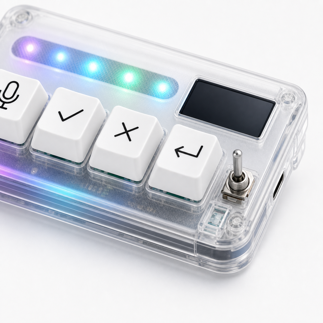
How HarnessKeys uses the clear body
HarnessKeys uses a compact transparent body alongside four workflow keys, USB and Bluetooth support, a custom status screen, and an RGB light bar. The clear design supports the product’s identity as a visible AI desk control, while the four keys provide the actual workflow function.
If you like the transparent look, treat it as a bonus after confirming the workflow fit. The device is strongest when the visual design reinforces real use: speak, approve, cancel, and continue.
Compare the full product details on the HarnessKeys product page. Before ordering, read payment methods and shipping delivery so the checkout and shipping expectations are clear.
When aesthetics should not decide the purchase
A clear shell should not override practical buying criteria. If you need a larger macro pad, a visual command deck, or a device with many app profiles, the transparent design does not change that. The shell can make the product more pleasant, but it cannot change the number of keys or the product’s focused AI workflow role.
Use the visual design as a tie-breaker, not the whole decision. First ask whether four keys, USB and Bluetooth, a status screen, and an AI-focused layout match your workflow. Then decide whether the transparent body fits your desk style.
How to compare clear-shell devices
If you are comparing transparent keypads, look at the whole object. Are the keys easy to identify? Does the clear body make the device easier to understand, or only more eye-catching? Does the lighting stay readable rather than noisy? Is the device compact enough for your desk?
The best transparent hardware feels intentional. It makes the internal device language visible while still letting the user focus on work. That is the standard buyers should use, rather than simply asking which product looks brighter.